
PORTFOLIO
MOCK UP
KEYROOMS
Year
AUGUST 2025
Overview:
Keyroom is a dependable hotel brand created for modern business and leisure travellers across the UK. Rooted in consistency, ease, and comfort, Keyroom reimagines chain accommodation with a sleek, dependable identity. Whether you’re checking in for a city break or a work trip, Keyroom is your key to a better stay.
Design Concept:
The branding revolves around an abstract key icon – vintage in silhouette, modern in linework – symbolising trust, access, and personal experience. The logotype is bold yet rounded, offering a sense of stability without feeling corporate or cold. A navy-and-gold colour palette evokes both warmth and professionalism, working seamlessly across digital and print applications. The typographic tone is friendly and reassuring, reflecting the brand’s ethos of stress-free stays and consistent service.
Mockups feature clean, spacious photography of stylish hotel interiors, paired with the tagline “Your Key to a Better Stay” to reinforce the brand’s metaphor. The combination of illustration, colour, and copy invites guests to expect more from a chain hotel.
Outcome:
The final identity is adaptable and refined, standing out across billboard campaigns, in-room print materials, digital bookings, and branded merchandise. Keyroom’s cohesive visual language helps position it as a recognisable, trustworthy choice - delivering quality, ease, and comfort in every location.


PORTFOLIO
MOCK UP
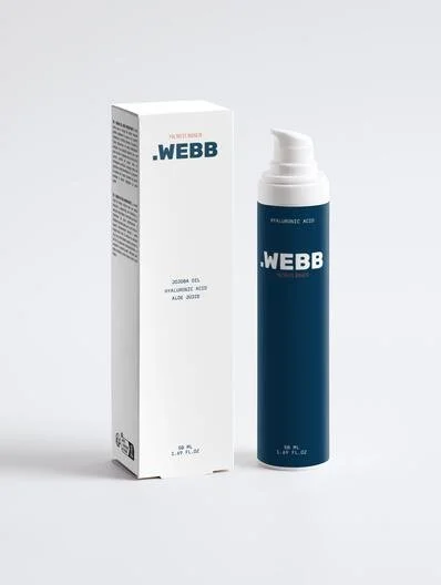
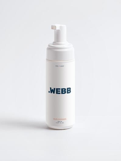
WEBB BEAUTY
Year
JANUARY 2025
Overview:
.WEBB Beauty is a conceptual skincare brand aimed at redefining minimalism in beauty. Designed as a high-end yet accessible line, the branding focuses on clean lines, soft lighting, and modern confidence, appealing to skincare-conscious consumers who value both form and function.
Design Concept:
The logo, styled in bold uppercase typography with a leading dot, creates a sleek and confident wordmark. The simplicity of the design evokes purity and transparency - mirroring the clean ingredients and honest messaging central to the brand’s ethos. Supporting visuals embrace a tactile, film-inspired aesthetic, celebrating natural beauty, raw textures, and emotional clarity.
Visual Style:
With a moody color palette and cinematic photography, the brand draws inspiration from Gen Z minimalism, luxury editorial spreads, and vintage film tones. This contrast between softness and strength makes .WEBB Beauty stand out as a modern, emotionally driven beauty concept.
Outcome:
This mock brand explores how skincare companies can merge style with substance -offering a clear, bold identity that’s ready to scale across packaging, digital marketing, and retail shelf presence.


PORTFOLIO
MOCK UP
CHAPTERS & COFFEE
Year
04/08/2025


Overview:
Chapters & Coffee is a warm, community-focused mock brand that blends the charm of a bookshop with the comfort of a specialty café. Designed with introverts, creatives, and the queer community in mind, the branding reflects an inclusive space where ideas, stories, and lattes all flow freely.
Design Concept:
The branding centers around soft serif typography and a muted, comforting palette of Soft Olive, Dusty Lilac, Oat Milk, Espresso Brown, and Ink Black. The logotype is elegant yet approachable, while supporting illustrations of books, mugs, and leaves reinforce the café’s creative and cozy atmosphere. Every design element was crafted to feel like a warm invitation - whether for a poetry night, a solo reading session, or just a quiet matcha.
Outcome:
The final identity is flexible and visually consistent across packaging, digital content, and print. The takeaway cup mock-up exemplifies the harmony between illustration, color, and typography. Chapters & Coffee stands as a visual concept for how branding can create a safe, inspiring environment.
PORTFOLIO
MOCK UP
Plant Pot Records
Year
10/02/2024
Overview:
Plant Pot Records is a bold, independent label rooted in creativity, community, and growth. The logo was designed to encapsulate these values - blending organic imagery with a modern Identity.
Design Concept:
The core concept CENTRES around a plant pot symbol, representing growth, nurturing talent, and cultivating artistry. Paired with a clean, modern typeface, the logo strikes a balance between playful and professional - perfectly reflecting the label’s artist-first ethos and DIY spirit.
Outcome:
The final logo is versatile across digital and print formats, easily adaptable for social media, merchandise, and marketing materials. It serves as a visual anchor for the brand’s identity as it continues to grow in the UK’s independent music scene.


